Budd Hopkins at NADA Miami
Budd Hopkins, City Three, 1974. Oil and acrylic on canvas, 22 × 36 inches / 55.9 × 91.4 cm. Courtesy Downs & Ross.
Editor’s Note: Downs & Ross will be exhibiting the work of Budd Hopkins (1931-2011) at NADA Miami from December 7-10, 2017.
The dualistic attitude which informs Hopkins’ work stems primarily from a dichotomy he experienced early in his career. When he came to New York in 1953 from Wheeling, West Virginia via Oberlin College it was the high-time of Abstract Expressionism. For that movement’s heroes – De Kooning, Kline, Pollack and Rothko – generalized public acceptance was just beginning, and their audience was still primarily confined to friends and colleagues. Hopkins felt closest to Kline and Rothko and they had the strongest influence on his work. Their impact on him and the excitement of the whole Abstract Expressionist pioneering ambience was only mitigated by his unwavering admiration for the kind of geometric abstraction epitomizes by Mondrian, and the expressive color of Matisse – both of which he found lacking to some extent in the art then being produced.
For Budd Hopkins, no longer surrounded by the hills and trees of West Virginia, immersed in a landscape of concrete, glass and steel which he viewed through the rectilinear frame of a window, a door, or building-lined streets, the fifties was a time of profound development. His youthful Gorkyesque automatic washes and drawings of curvilinear, vegetal forms slowly became subsumed within an increasingly rigid structure of horizontals and verticals. By working automatically in these formative years however, he allowed his basic formal vocabulary – a congruence of circular and triangular forms with the canvas rectangle – to emerge naturally. This is one of the reasons why his personal image is so memorable, and so readily recognizable.
By the time he painted Lasemann in 1958, in which a Rothko-like rectangle floats near the top supported by a central triangular form, Hopkins had begun to shift into a much more powerful compositional gear. In 1959 and 1960 he began to underline this stability with a somber, predominantly gray, blue and brown range of color. Curvilinear forms yielded to the domination of straight lines and square edges during these years, not to reassert themselves until the mid-sixties with the re-emergence of the circle in his work. While the structural scaffoldings became more architecturally sound, his brushwork became increasingly freer and more arbitrary. HIs technical handling of paint -splattering, scraping, stumbling, dragging, and dry brushing it across the surface- reached a peak of facility during the early sixties which he has never since attempted to duplicate. That the division of his surfaces into clear rectangular units of quasi-sculptural solidity remained a constant in spite of, and in conjunction with, all this loose painterliness is quite evident in even so small a work as his oil on paper Study for Bordeaux of 1961.
Partially in response to the work of Fernand Leger, which has long been important to him, Hopkins began to introduce explicitly hard-edged forms into his work by 1962. Little Northeast of 1963 is among the most warmly-hued paintings in his initial series of oils including letter forms. Its rich purplish, green and blue colors are put into relief by the richly textured and dazzling whiteness of the rectangular shape descending from the top of the canvas. It was during this period that Hopkins began to use collage in his preparatory studies for paintings. This is true of Little Northeast which clearly reflects the characteristics of the medium- fragmentation, discontinuous space, and the juxtaposition of contradictory elements. All of these qualities lend collage singular expressive import in this century, characterized as it is by an overwhelming simultaneous multiplicity of information and events.
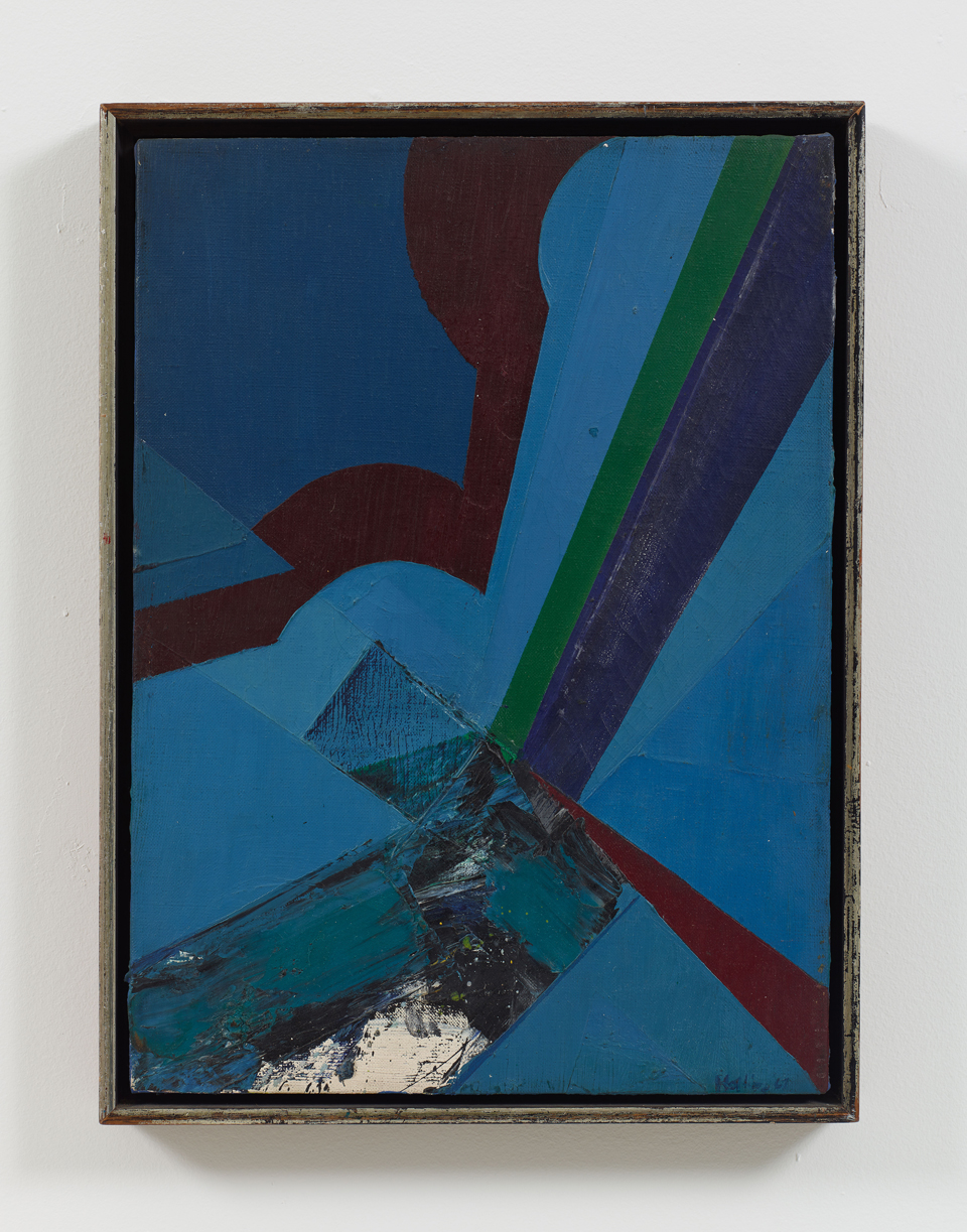
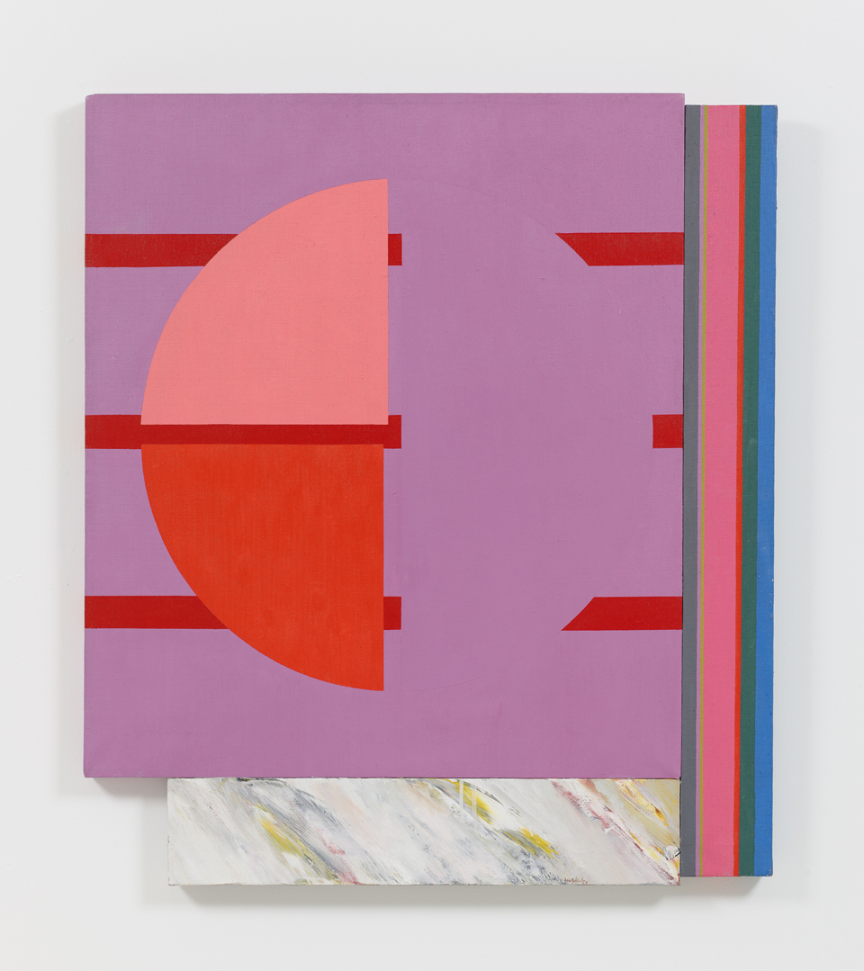
Budd Hopkins, Study for Ascension, 1967. Oil on canvas, 15 × 11 inches / 38.1 × 27.9 cm. Courtesy Downs & Ross.
The black and white collage in the collection of the Whitney Museum of American Art is an example of Hopkins’ use of collage as a pure expressive medium along these lines. His collagist attitude during the mid-sixties enabled him to move in the elusive space of his field with explosive force. The razor-sharp edges which resulted dominate his work by the time paintings like Yarmouth and Red Wall Painting were executed. They provided him with a method of concretizing the implicit geometries of Abstract Expressionism without sacrificing any of its energy. He never utilized the neutralizing, “cooling” effects of linear separations between adjacent hues that most of the other sixties artists used. A white or a black band between even strongly contrasted hues will tend to equalize them and minimize their spatial characteristics. Hopkins continued to juxtapose his hues and this energized his edges and his forms optically. He also stepped-up the intensity of his color steadily over the years, moving more and more into using a preponderance of pure, unmixed, tube colors in recent years. This has greatly enhanced the masculinity of his colorist.
Sun Black I is a pivotal work in Hopkins’ career. This is because it is the first major work to contain a prominent, centralizing circle. From this point on, the circle dominates most of his paintings. It is his personal image and it provides his work with hypnotic force – with a place in the painting where energy can be concentrated and from which it may be dispersed. The circle brings everything together. It is the hierarchical equivalent of Mondrian’s squares or Rothko’s rectangles, and it supplies a focus for the kind of clearly constructed ordering of values he had to establish in order to make his essential connection with the art of the past.
Hopkins firmly believes that “Hierarchical organization is an essential art principle behind art at its deepest throughout its whole history because it’s the way we perceive the world – in terms of what’s important and what’s unimportant.” All-over and grid paintings are based on simple ordering which involves few decisions and a somewhat passive attitude toward the chaos of contemporary life. The differentiating faculties necessary for the very complex ordering of values that occurs in hierarchically organized painting are most effective when they are grounded in very positive and well-conceived aesthetic attitudes. Mondrian and Newman managed it all beautifully in their best paintings, convinced that they were thereby establishing beneficial moral values for mankind. Budd Hopkins feels that “The concept of hierarchy is anthropomorphic. The physiognomy of a painting relates somehow to that of a human being, and when that is expressed in paint it embeds the work directly into our lives. A painting at its best is as complex and fascinating as a person.”
These principles receive their first full crystallization in the Gemini series of monumental black and white paintings, begun in 1968. Massive planes, like fragments of a secret world of unknowable imagery which lies tantalizingly near visibility beneath their surfaces. Both color and painterly freedom are minimized in favor of an austere conceptual rigor in a painting like the great Gemini I, in the collection of Maximilian Schell. The grand formality of such a work is diffused in other paintings, like Saratoga of 1969 and Norbeck of 1970 in order to promote coloristic expressivity. Also in 1970, Hopkins began the Montezuma series of light-filled, drastically simplified paintings which center around his old theme of circle and triangle within a rectangle.
Throughout his career he has periodically downshifted into quieter emotional gears in this way, as if to gather his forces for even larger statements. Two major triptychs resulted in this case: Gray Wall Painting and Homage to Franz Kline, in 1971. The former is a kind of summation, in the tonalities of gray, blue and green which had prevailed in the early years of his career, of many more recent attitudes; the latter bespeaks a new direction toward intense formal dynamism and a new structural colorist which is highly reminiscent of the work of Matisse.
Late in 1971, again almost by way of relief from the emotional intensity of such a painting as the Homage to Franz Kline, Hopkins began a series of simplified divided circle paintings based on a Leger motif. All of these paintings are titled after signs of the zodiac. They represent a stylistic departure in that their huge plans of bright, unmodulated color coalesce optically to reiterate the shape of the canvas on which they float as a single united field. Literalizing the pictorial context in this way does not make obvious use of the collage technique. But, even though the fused fields of color compel a reading as unitary shapes, they are actually interrupted by linear elements which connect their edges, and the edges of the canvas, to a large dominating circle like arrows pointing to a center of emotional energy. In a work like Aquarius III, for instance, this relationship is very misleading, because it implies that the center of the circle is in the center of the field. Actually it is located eccentrically, and this forms the initial ambiguity of the work connecting it with the discontinuity and spatial complexity of collage. It does nothing to diminish the single-image impact of a dazzling yellow painting like Libra IV, which seems as emblematic as a flag, however.
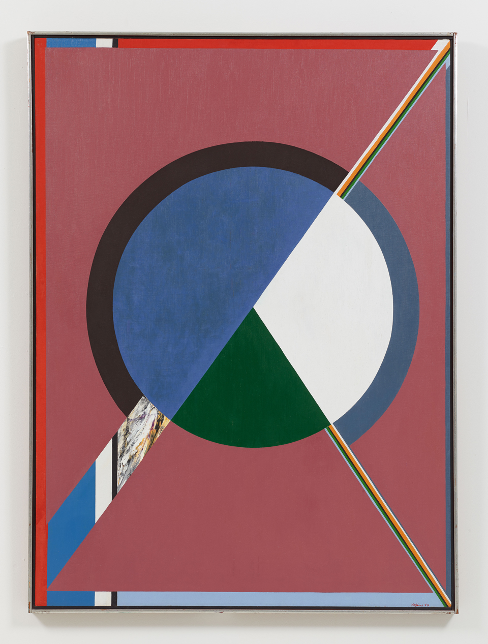
Aquarius V, 1972. Acrylic on canvas, 52 × 38 inches / 132.1 × 96.5 cm. Courtesy Downs & Ross.
It is typical of all Hopkins’ paintings from that era that numerous elements emerge to prominence in the viewer’s perception as soon as the initial impact of the color and the large, dominant forms has had its effect. The planes of pure color in a painting like Aquarius III begin to separate and shift their places in its space as if juggling for time and attention. Some of them seem to bound forward into the space of the room, as if to share real-time with the viewer. Others seem to exist behind the surface of the canvas like forgotten memories of the past or palimpsests which serve to remind us of the various other forms the painting might have been given. Narrow bands of color zip in and out of the field across and behind larger elements binding the space and time of the painting together and pointing to some mysterious possibility for an extension into the future. The primary colors which predominated in the beginning of the series vibrate in relationship with smaller areas of secondary hues and the inclusion of odd terms, like a green, ochre, or brown put the entire color range into relief. Black and white functions marginally in most of the 1971-1973 paintings, but it is a strong reminder about the tonal range being covered by the colors as well as a hind that the painting might have existed, and functioned (in the manner of a Gemini painting) without color. This coloristic procedure is reversed in the Virgo paintings and in most recent series of triptychs, initiated with Mahler’s Castle I. Here moody, dusky secondary hues -wine reds, maroons, lavenders, pinks and blues- are optically activated by proportionally smaller areas of bright primary colors. Later paintings look as if they coalesced magically, like the chips of colored light in a kaleidoscope.
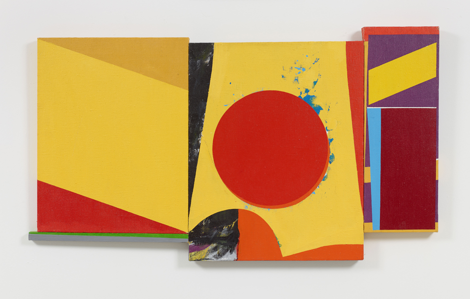
Budd Hopkins, Third Street Red, 1974. Acrylic and oil on canvas, 37 1/2 × 32 inches / 95.2 × 81.3 cm. Courtesy Downs & Ross.
Mahler’s Castle I exemplifies a shift away from the holistic single image paintings of 1971 and 1972 to a new hieraticism. Both Mondrian and Newman, for instance, were masters at building scale referents into their paintings too. Frank Stella and many of the other post-painterly abstractionists tended to ignore this essential pictorial element and to rely on size alone to convey a sensation of monumentality. Hopkins’ formal vocabulary covers a complete range from huge planes on down to tiny dots and lines within the freely brushed areas. The small, bounded places of minutely nuanced painterliness provide keys to the scale of all the other elements in his paintings, as well as to their colors, velocities and directions. They are in resolutely calligraphic and organic contrast to the geometric rigidity surrounding them and seem to break the smooth continuity of his surfaces. By doing so they deliver a symbolic message which is an essential part of Hopkins’ dualistic attitude. They say something about the existence of the unexpected, irrational, and infinite within life’s most clearly ordered and controlled systems. Hopkins’ paintings contain both color and black and white, hard edges and soft. His work is warm and cool, open and closed, solid and transparent, complete and open ended – all at once. Each painting is a contained world unto itself, while it implies infinite extensibility and is, in a very human way, contradictory, ambiguous, and deeply complex.
